
Amazon has just released Kindle Previewer 3. It allows authors and publishers to get a sense on how their e-books will look on Kindles and Fire tablets using the new typesetting engine.
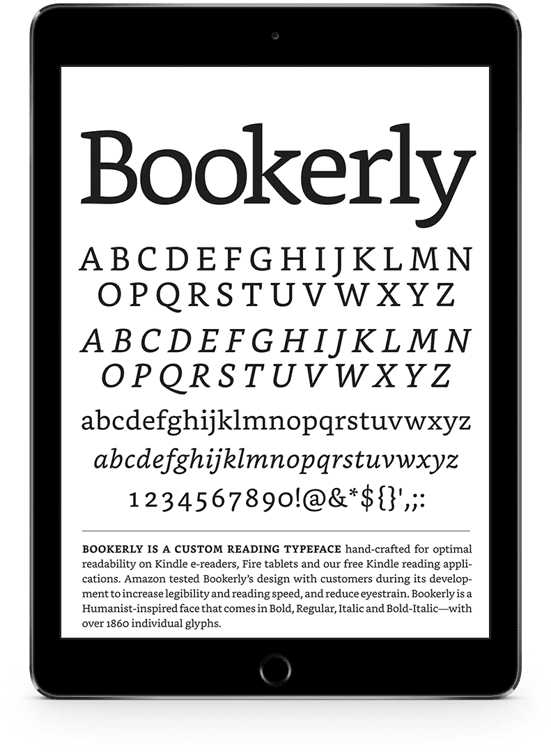
Last year Amazon released a new font called Bookerly, which replaced Caecilia as the new default font for the Kindle Fire line of tablets and their fleet of apps. Bookerly is a serif style of font that has been custom-made by Amazon to be as readable across as many different types of screens as possible. Like Google’s Literata, Bookerly is meant to address many of the aesthetic issues surrounding e-book fonts. A few months after Bookerly was released Amazon sought to address the Kindle’s typesetting problems with an all-new layout engine that introduces better text justification, kerning, drop caps and image positioning.
When publishers and indie authors submit e-books to Amazon it was a total mystery how their titles would look using the new fonts and layout engine. This mystery should be dispelled with the advent of Kindle Previewer 3, a free tool for PC and MAC.
You can download Kindle Previewer 3 Beta from Amazon.
Michael Kozlowski is the editor-in-chief at Good e-Reader and has written about audiobooks and e-readers for the past fifteen years. Newspapers and websites such as the CBC, CNET, Engadget, Huffington Post and the New York Times have picked up his articles. He Lives in Vancouver, British Columbia, Canada.