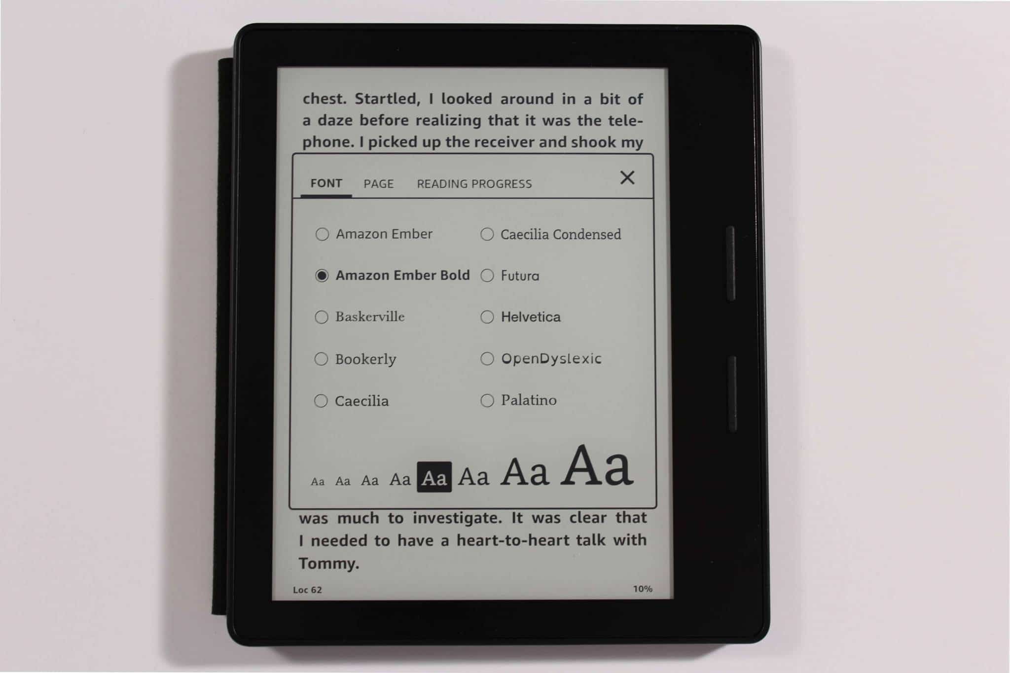
In November 2016 Amazon released a new font called Ember Bold for the Kindle Oasis, Kindle Paperwhite and Kindle Voyage. This new typeface will give older readers and people with vision problems an opportunity to read their favorite e-books.
In the past, one of the biggest complaints that people with vision problems had with the Amazon Kindle is that regular fonts were difficult to read. This has resulted in many users switching to Kobo e-readers, which have more versatility in font selection and allow for the importing of custom fonts. Others have elected to download specific apps for their smartphones and tablets. It looks like Amazon has just solved one of the biggest lingering issues with the advent of Ember Bold.
In the video below we will show you how Ember Bold looks on the Kindle Oasis, this will give you a sense on what this font brings to the table and if it is something you would use on a daily basis.
Michael Kozlowski is the editor-in-chief at Good e-Reader and has written about audiobooks and e-readers for the past fifteen years. Newspapers and websites such as the CBC, CNET, Engadget, Huffington Post and the New York Times have picked up his articles. He Lives in Vancouver, British Columbia, Canada.

