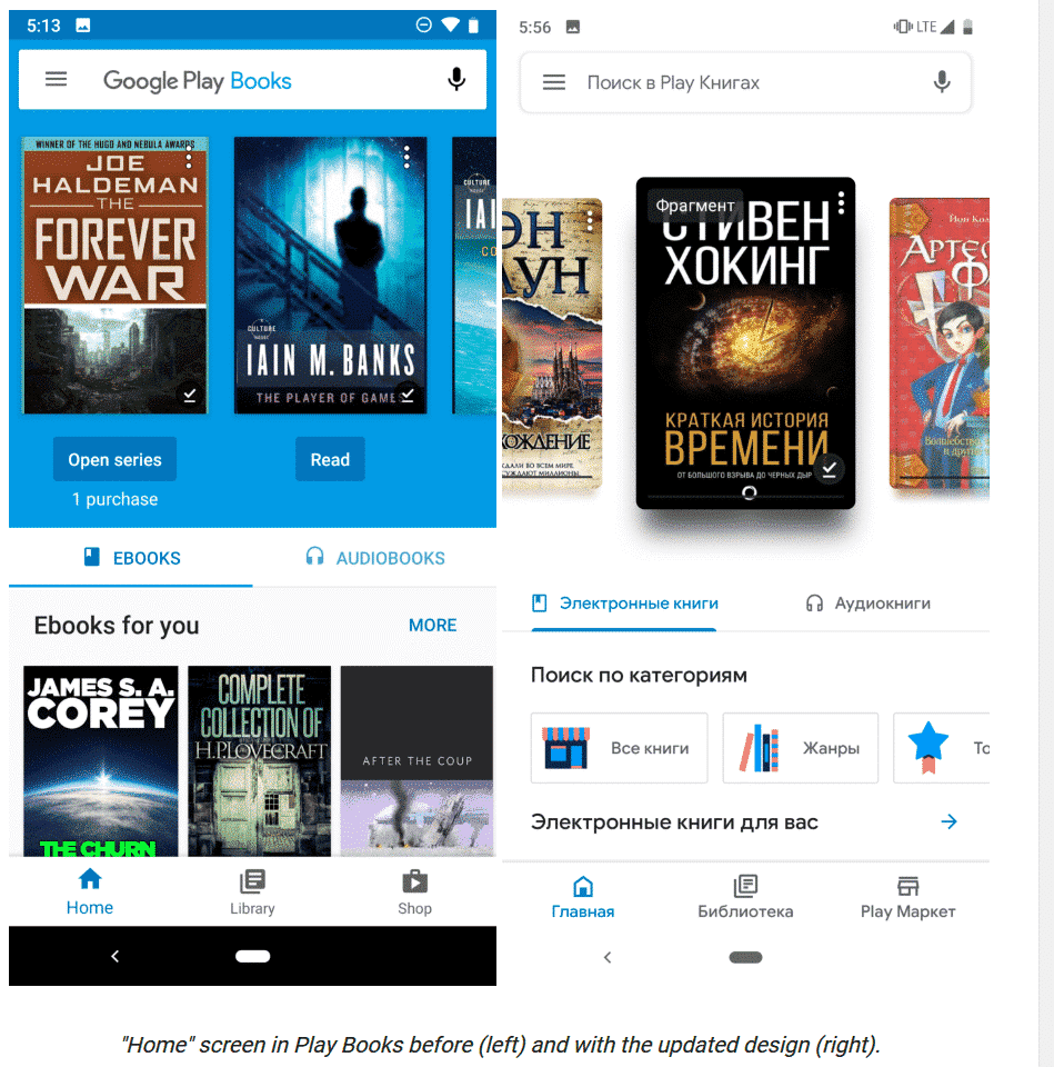
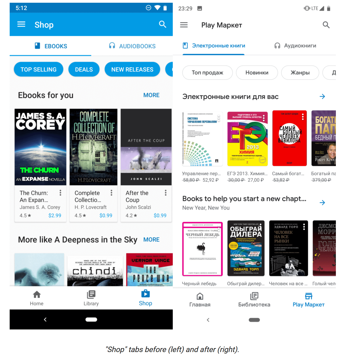
Google has updated Play Books with a new material design that makes it look more minimalist and streamlined. The redesign is mainly all about aesthetics, the iconography is now hollow, backgrounds are mostly white, and fonts have been replaced with Google/Product Sans. The carousel on the home screen is now smaller and more compact and this change also is applicable to the bookstore.
The reading experience on the app hasn’t changed much, although the small tweaks aren’t good for those who want better accessibility to the app. Some of the text on the page have shrunk and some of the interactive elements are also smaller. Although of course you can always adjust the font sizes since this is an ebook reader after all.
There is no word on when the new Google Play Books redesign will go live in Canada and the US, but it is currently being pushed out to some markets.
Michael Kozlowski is the editor-in-chief at Good e-Reader and has written about audiobooks and e-readers for the past fifteen years. Newspapers and websites such as the CBC, CNET, Engadget, Huffington Post and the New York Times have picked up his articles. He Lives in Vancouver, British Columbia, Canada.

