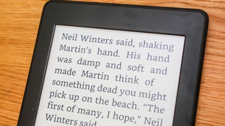
Amazon Ember and Bookerly are two fonts that were exclusively developed for Kindle e-Readers. Bookerly is a serif font and is available on most Kindle e-ink devices, but also on the companies line of Fire Tablets. Ember on the other-hand is a sans-serif font and first showed up on the Kindle Oasis when it was released last year. Amazon has also included the Ember font on the new Kindle 8th Generation.
Amazon has not been very forthcoming about Ember font and provides no documentation on the inner workings and mechanics. If you have an e-ink Kindle and installed the 5.7 update you would have likely noticed the new home screen that was revised earlier this year. The main home screen actually uses the Ember font, the text that says “GoodReads” for example uses Ember.
Bookerly was developed last year and many of the Kindle devices and apps use it as the default font. It was designed to solve the Kindle’s typesetting problems with an all-new layout engine that introduces better text justification, kerning, drop caps, image positioning, and more.
According to Amazon’s internal tests, Bookerly is 2% easier on the eye. That may seem like a small improvement, but spread that 2% across millions of Kindle users and billions of pages of e-reading, and it all starts to add up.
In the video below we compare the Bookerly and Ember fonts side by side. The one thing I noticed that there was more spacing between words using Ember. This might be useful for people who love to read, but find the words start blurring together.
Michael Kozlowski is the editor-in-chief at Good e-Reader and has written about audiobooks and e-readers for the past fifteen years. Newspapers and websites such as the CBC, CNET, Engadget, Huffington Post and the New York Times have picked up his articles. He Lives in Vancouver, British Columbia, Canada.

