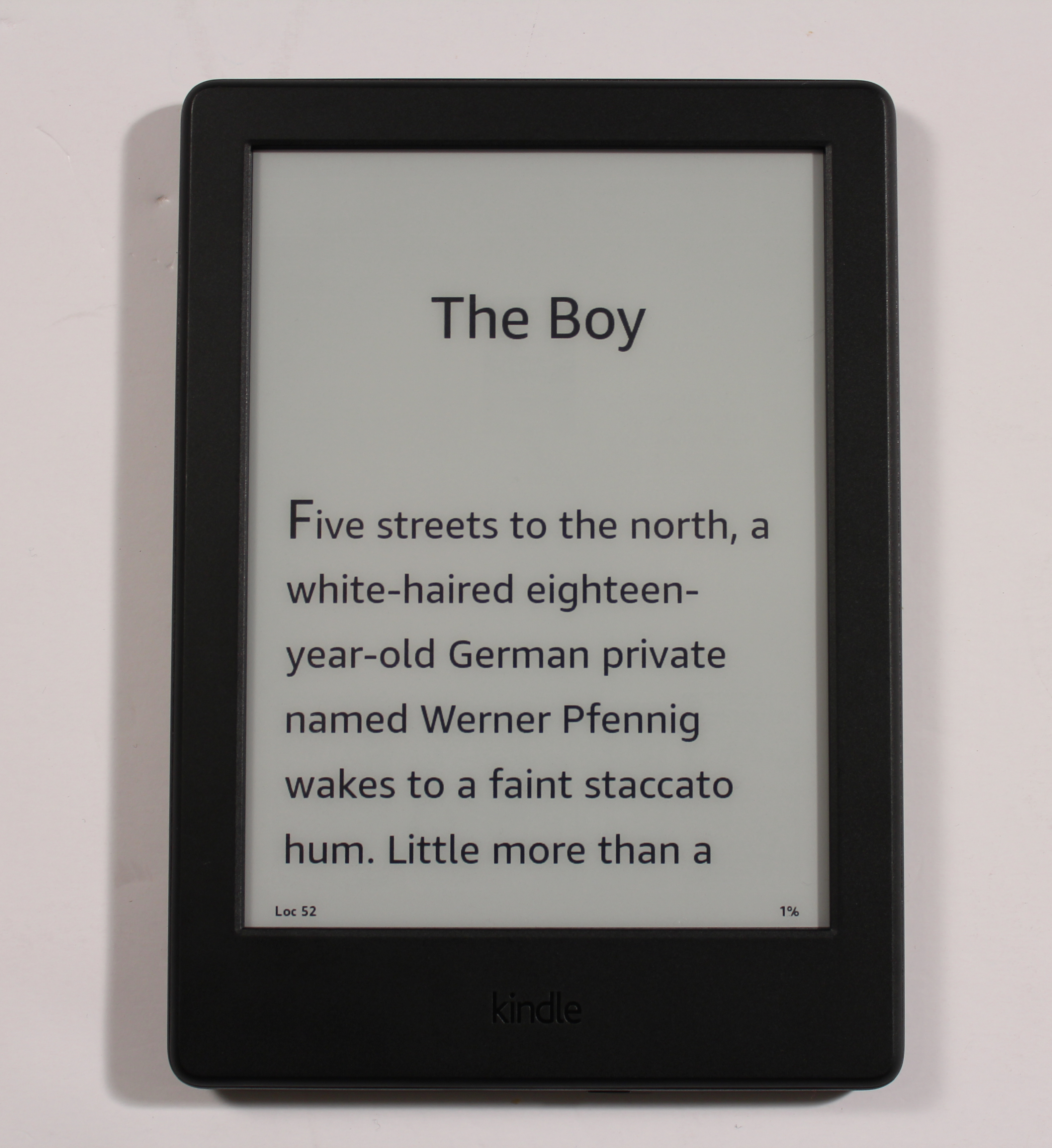
The new Amazon Kindle has been available for a few weeks and this is the first model that you can choose a different color. Most Kindles are only available in black, but you now have the option to select white. This is the first time the entry level Kindle has undergone a dramatic change, the last time this occurred was in 2014. Is this worth upgrading if you have an older Kindle?
Hardware
The 8th Generation Kindle has a six inch e-Ink Pearl display with a resolution of 800 X 600 and 167 PPI. It does not have a capacitive touchscreen, instead it employs Infrared Touch technology by Neonode. Pearl is really outdated by modern conventions, the screen was first developed in 2010. The only e-readers that currently use it are entry level models, such as the Kobo Touch 2.0.
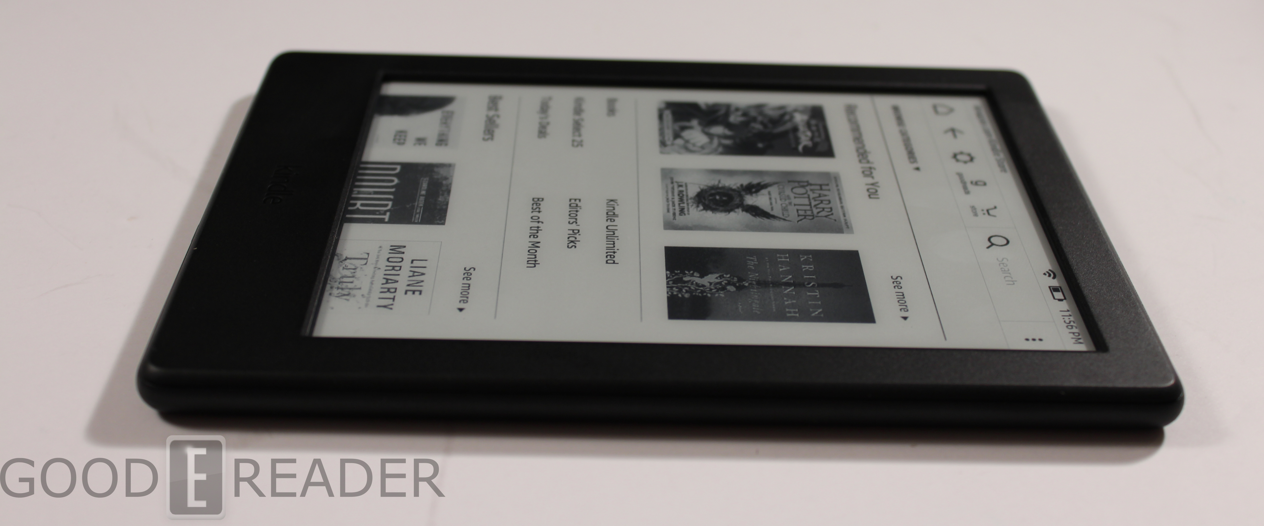
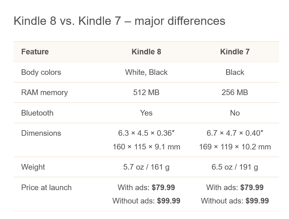
If you have the Kindle that was released in 2014, this model is quite an upgrade. It has 512 MB of RAM, whereas the older version only had a paltry 128 MB. Internal storage has also been increased to 4 GB, which will give you an adequate amount of space for your personal collection of MOBI/PRC or PDF files.
Somehow Amazon managed to make this device have a smaller footprint, but it actually weighs less than the 2014 edition. It weighs 5.7 oz / 161 g, whereas the older iteration weighs 6.5 oz / 191 g.
One of the big improvements with the Kindle upgrade was the inclusion of Bluetooth. This is so users can take advantage of the new VoiceView technology.
VoiceView for Kindle uses Amazon’s natural language text-to-speech voices (formerly known as IVONA) to let visually impaired customers read millions of Kindle books and navigate the Kindle via speech feedback. Like VoiceView on the Fire tablets, VoiceView for Kindle supports linear and touch navigation, and the same broad range of speech feedback rates and earcons.
Visually impaired customers will be able to use VoiceView for Kindle with the new Kindle Audio Adapter—an Amazon-designed USB audio dongle—to connect headphones or speakers, which then allows the ability to listen to and navigate the user interface, in addition to listening to books.
Overall I like the design of this e-reader. It does not have a front-light, so you will need to buy a case with a light build into it or make sure you have the lamp on.
Software
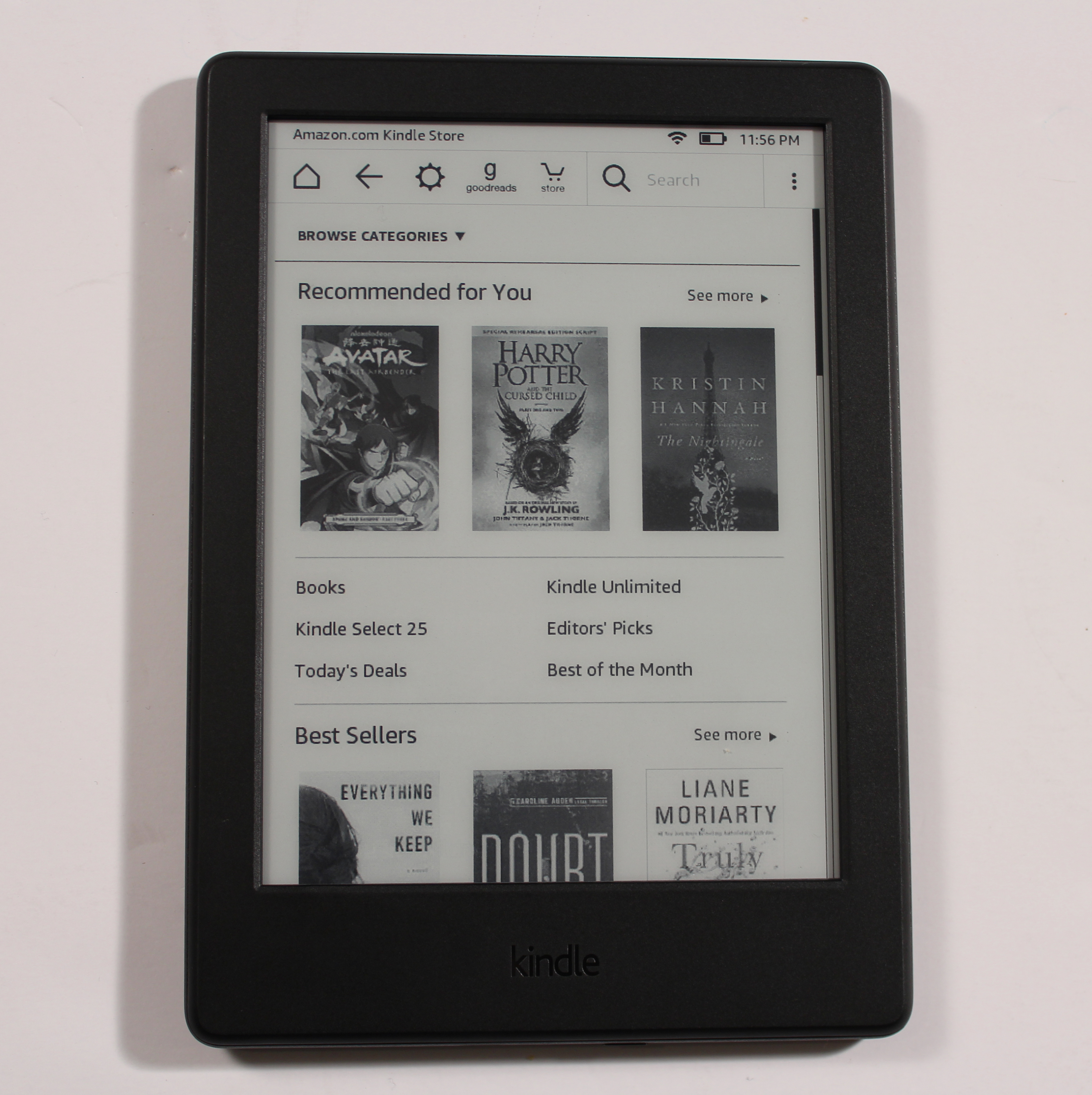
Earlier this year Amazon pushed out a massive firmware update to their entire fleet of e-readers. The homescreen has a dramatic refresh and it modernizes the entire user-interface. It lists the books you are currently reading and gives you a percentage of how far you made it. It takes up more than half of the screen, which is useful if you want to immediately jump into your current read. The old home screen basically just listed all of the books in your library, if you have a lot of content, it was a chore to find whatever book you are in the midst of reading.
Likely the feature I dig the most is how the navigation bar has changed. It now gives you text underneath GoodReads and the Kindle bookstore, rather than just relying on icons, which obviously makes it a little more intuitive for new users. There is also a quick settings button that you can turn off the wireless internet access or turn on/off features such as Wordwise or Public Notes.
I think Amazon has one of the best user experiences in the e-reader arena. Their bookstore has a ton of content, from short-fiction to bestselling novels. Everything is categorized very well, there isn’t a ton of genres and options to overwhelm you, there is a heavy emphasis on cover art.
If you shop on the main Amazon.com website and click on a book or a product page you will feel right at home on the Kindle e-Reader. You basically have a stripped down, e-ink friendly version of the quintessential product page and it even lists all of the reviews that people have left. If you are still unsure whether a book is good or not, you can download a free sample.
Amazon controls roughly 75% of the digital book market in the United States and 95% in the United Kingdom. Needless to say, they are making it really easy to buy books.
E-Reading Experience
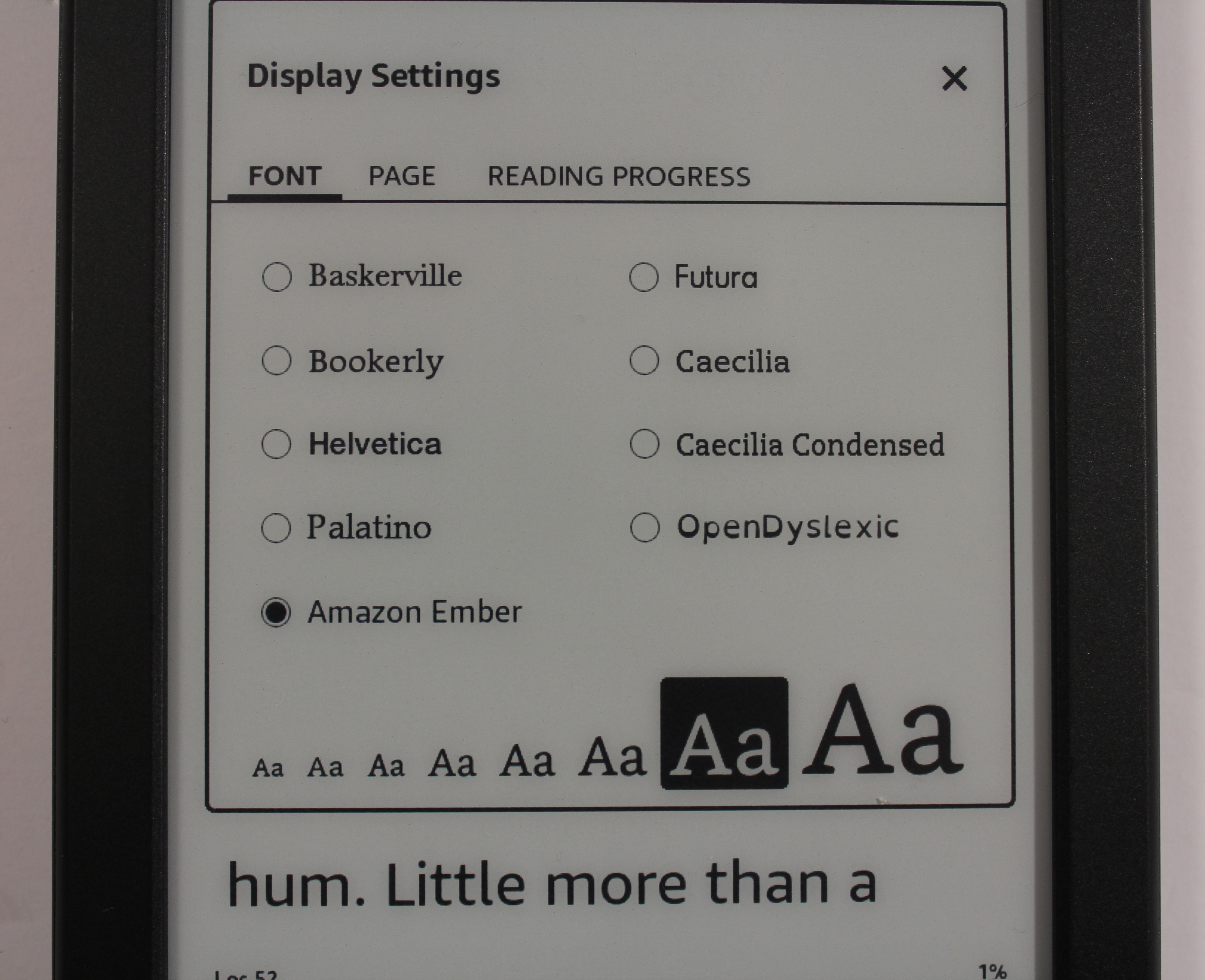
Amazon gives you more freedom to craft your e-book reading experience than most other companies. You can chance the font size from approximately 8-point size to 36-point size. There are also more fonts than ever before, with a few Amazon developed exclusively for e-readers; Bookerly and Ember.
Bookerly was launched in May 2015 and replaced Caecilia as the new default font for the Kindle. Bookerly is a serif style of font that has been custom-made by Amazon to be as readable across as many different types of screens as possible. Like Google’s Literata, Bookerly is meant to address many of the aesthetic issues surrounding e-book fonts.
Ember is the font used on the Kindle’s home screen since the 5.7 update. It is a sans-serif font, but there is a ton of confusion on what this font actually does on the Kindle. Let me break it down. Ember at its very core provides more spacing between words. Bookerly makes digital text appear the closest to a real book, but some people find that text seems to blur this way. Ember gives a few extra pixels between each word, giving a small, but noticeable space between two words. I guess Amazon wanted to make it so reading on a six inch screen was a great experience for people who like text to display differently.
Amazon gets a lot of flack from people who like more control over margins and linespacing. The Kindle only gives you three different options to control it, but I feel its enough. Too much choice overwhelms the user, if you want more advanced controls, most Kobo e-readers have a TON.
When you are reading a book you can swipe or tap to turn a page. If you hold down on a word you can define it with various downloadable dictionaries or translate it from one language to another using Microsoft Translate.
The one thing the 8th Generation Kindle does poorly, is handle PDF files. The resolution is poor and most text and images are washed out. There are some controls that let you darken or lighten up a specific document or page, but I feel there is no happy medium with complex documents. When you pinch and zoom to find that sweet spot, it defaults back to the area view whenever you turn a page. The PDF rendering engine is also slow, since the processor on this model is very low, when compared to the Paperwhite, Voyage or Oasis.
Wrap Up
I would recommend this e-reader to anyone who has never owned one before and does not want to spend a lot of money. This unit is available in the Specific Offers version for $79 (it will show ads on the homescreen and bottom of your library) or the ad free model for $99.99. If you own the 2014 Kindle Basic you will notice, it is also worth the upgrade. It is thinner, lighter, has Bluetooth and has double the RAM and internal storage.
If someone asked me right now, what the best value for your dollar is, I would likely tell them to get the Paperwhite, but wait for it to go on sale. It has a light, has better specs and can often be purchased for under $99.
PROS
Double the RAM and Storage compared to the 2014 Kindle
Available in Black or White
Ember and Bookerly Font is great for reading
Thin and Light
Affordable
CONS
Poor Resolution
Outdated Neonode Infrared Touch
NO SD Card
PDF Experience is Lackluster
Feels Sluggish
Verdict – Buy the Paperwhite on Sale
Rating: 6/10
Michael Kozlowski is the editor-in-chief at Good e-Reader and has written about audiobooks and e-readers for the past fifteen years. Newspapers and websites such as the CBC, CNET, Engadget, Huffington Post and the New York Times have picked up his articles. He Lives in Vancouver, British Columbia, Canada.
