This year E INK released Kaleido, a new form of color e-paper that was designed for e-readers, e-notes and smartphones. Most of these devices have 300 PPI to read black and white content, such as ebooks. These devices can display 4,096 different color combinations up to 100 PPI. The way the technology works, is that you can read both black and white text at 300 PPI and colors at 100 PPI, on the same page. This is useful if you are reading a biography ebook, where there are tons of pictures in the center, and also text, giving readers context. It also works using a web-browser, or other ebooks. The B&W and Color filter have a hard time with PDF files, because they are basically big image files, although some PDF render engines can convert the PDF images to pictures AND text. CBR/CBZ, are popular formats for comics or manga, but they are basically containers for a series of jpg/png files.
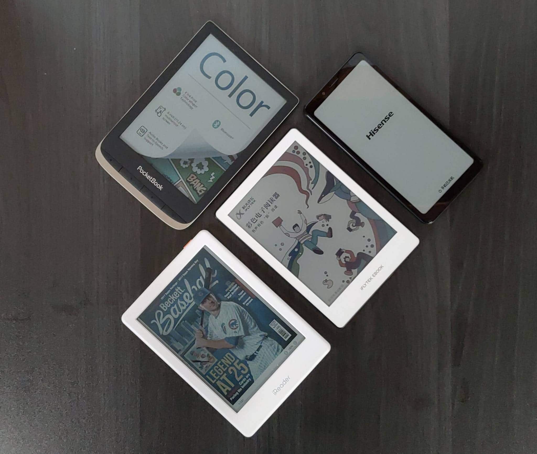
There are only a handful of color e-readers that have come out this year, we have reviewed almost all of them, except for the Onyx Boox Poke 2 color, which only went on sale for a day, before it was sold out. The current e-readers that have color E INK are the Pocketbook Color, iReader C6, iFlytek Book C1 and smartphones include the Hisense A5C and Hisense A5 Pro CC.
Almost all of these e-readers and smartphones use a sunken screen, with a plastic based e-paper layer on top. This provides no barriers for the reading experience and gives us the best resolution possible. The iFlytek is the only color e-reader that has a glass based layer and both Hisense phones have a glass layer, and come shipped with a matte screen protector.
The Pocketbook Color is using around 24 white LED lights, which currently provides the best lighting system out of all of the different e-readers and phones. The iReader is using white AND blue LED lights, which creates this weird screen effect, it is different. All of the rest use white led lights. Currently none of these models have a color temperature system or utilize amber LED lights. My take, is because it would make all of the colors look super weird. I have also noticed that color E INK NEEDS the front-light on, or the screens are too dim. It just might be the way the color filter array is on-top of the standard E INK layer, so because the color filter is on top, it needs more light, in order for any color content to be visible. If you are just reading a typical ebook, you don’t really need the front-light on, because of the B&W text. The front-light is only really necessary with color.
There should be at least be two other color e-readers to be released this year. One should be announced within the next month, the other in September/October.
This video will give you a sense on the different e-readers and phones that are available and showcase their industrial design.
Michael Kozlowski is the editor-in-chief at Good e-Reader and has written about audiobooks and e-readers for the past fifteen years. Newspapers and websites such as the CBC, CNET, Engadget, Huffington Post and the New York Times have picked up his articles. He Lives in Vancouver, British Columbia, Canada.
