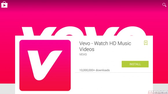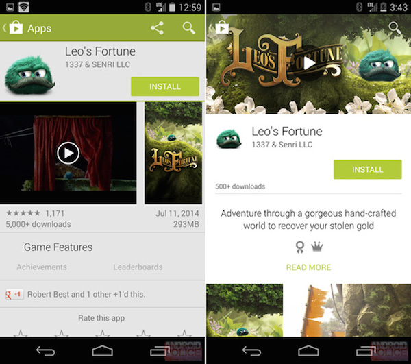
At the Google I/O conference this year, we were treated to news that the latest version of Android would also come with a new Material Design UI –complete with an updated look and feel that would persist through to most of Google’s apps as well. A full tour of the design changes won’t be possible until the fall, but until then we will have to have our curiosity satiated by sneak peeks. To that end, we’ve seen a little bit of what the new Google Play Store will look like.
The primary difference with Material Design is whitespace (and lots of it) combined with large header images that make it easy for users to skim the content.

It goes without saying that these leaked images should be considered part of the rumour mill at this point, Google may surprise us with something else entirely when the time comes.