Amazon released a new Kindle Paperwhite in July and the tech specs are basically the same as the 2015 edition, except this model is available in white. Tradtionally Amazon has always released e-readers that are black and now that a white one is easily accessible in North America and Europe many people are wondering if the new white body hinders or enhances the e-book reading experience. Our review will look at the hardware, software and see if the new color makes a difference.
Hardware
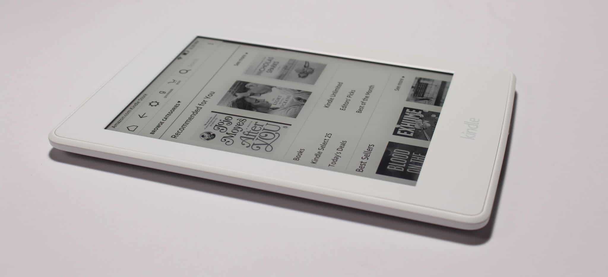
The Amazon Kindle Paperwhite 3 has a e-ink Carta display screen with a resolution of 1430×1080 and 300 PPI. This device has a sunken screen, whereas the Oasis and Voyage both have flush screens and bezels. This is one of the big reasons why the Paperwhite is affordable at $119.
This e-reader has a front-lit display, that allows you to illuminate the screen so you can read in the dark. It has four LED lights that power the front-lit display, whereas the Voyage has six and the Oasis 10.
Underneath the hood is a 1 GHZ processor and 512 MB of RAM. There is 4 GB of internal storage and the majority of your content will be held in the cloud. There is certainly enough space to have a thousand e-books on your device at any given time. Amazon does not include SD cards in their modern e-readers so you will not be able to increase the memory beyond 4 GB.
Does the new white color make a difference? I noticed that the white bezel makes the screen look more grey than the black model. I don’t know if this phenomenon in indicative to just the revised Paperwhite because the Kindle Basic 2016 model has the same problem.
Software
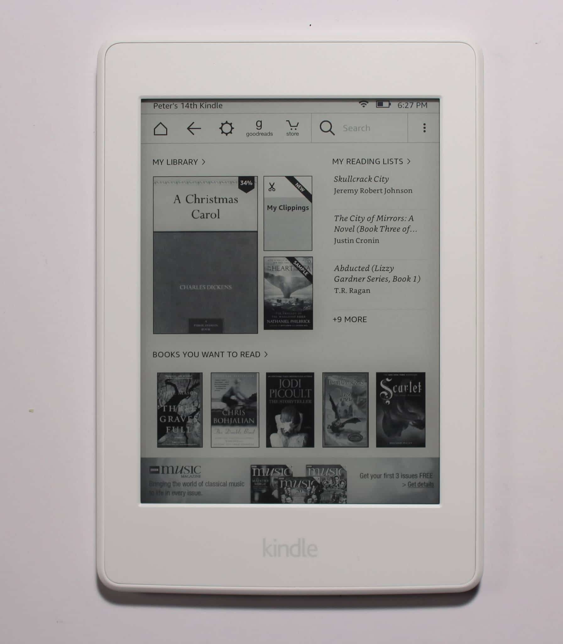
The home screen and overall design of the UI were heavily revised last year with an all-new typesetting engine that lays out words just as the author intended for beautiful rendering of pages. With improved character spacing and the addition of hyphenation, justification, kerning, ligatures, and drop cap support. There is also support for larger font sizes without compromising your reading experience. Page layout and margins will automatically adapt to work well at even the largest font sizes.
Amazon doesn’t control the digital book market because it makes great hardware, but it has software elements that no rival can match. X-Ray is a great example because it allows you to get a sense of the people, places and things in a book and how often they are referenced. This is tremendously useful for people who juggle multiple books at once or come back to a book that they put down for a few months and forget who all the characters are.
Amazon also has Wordwise, which basically gives you a list of synonyms and homonyms in a book, great for learning a new language. If you normally share your e-reader with multiple family members, Family Sharing allows you to share the same content using different Amazon accounts. You can also take advantage of the translate capability by tapping any word or highlight a section to instantly translate it into other languages, including Spanish, Japanese, and more. Translations are provided by Bing Translator and you can even do it with PDF files, which is totally awesome.
Likely one of the biggest selling points is the social book discovery site, GoodReads. Placed right on the navigation bar you can talk about your favorite books with a community geared towards discussion and reviews. You can form or join a book club and bring a little bit of socialization to a otherwise solitary reading experience. You can follow your favorite authors and ask them questions, sometimes they even do community Q/A’s. One of the features I like is how you can import in your Kindle collection and GoodReads will make solid recommendations.
e-Reading Experience
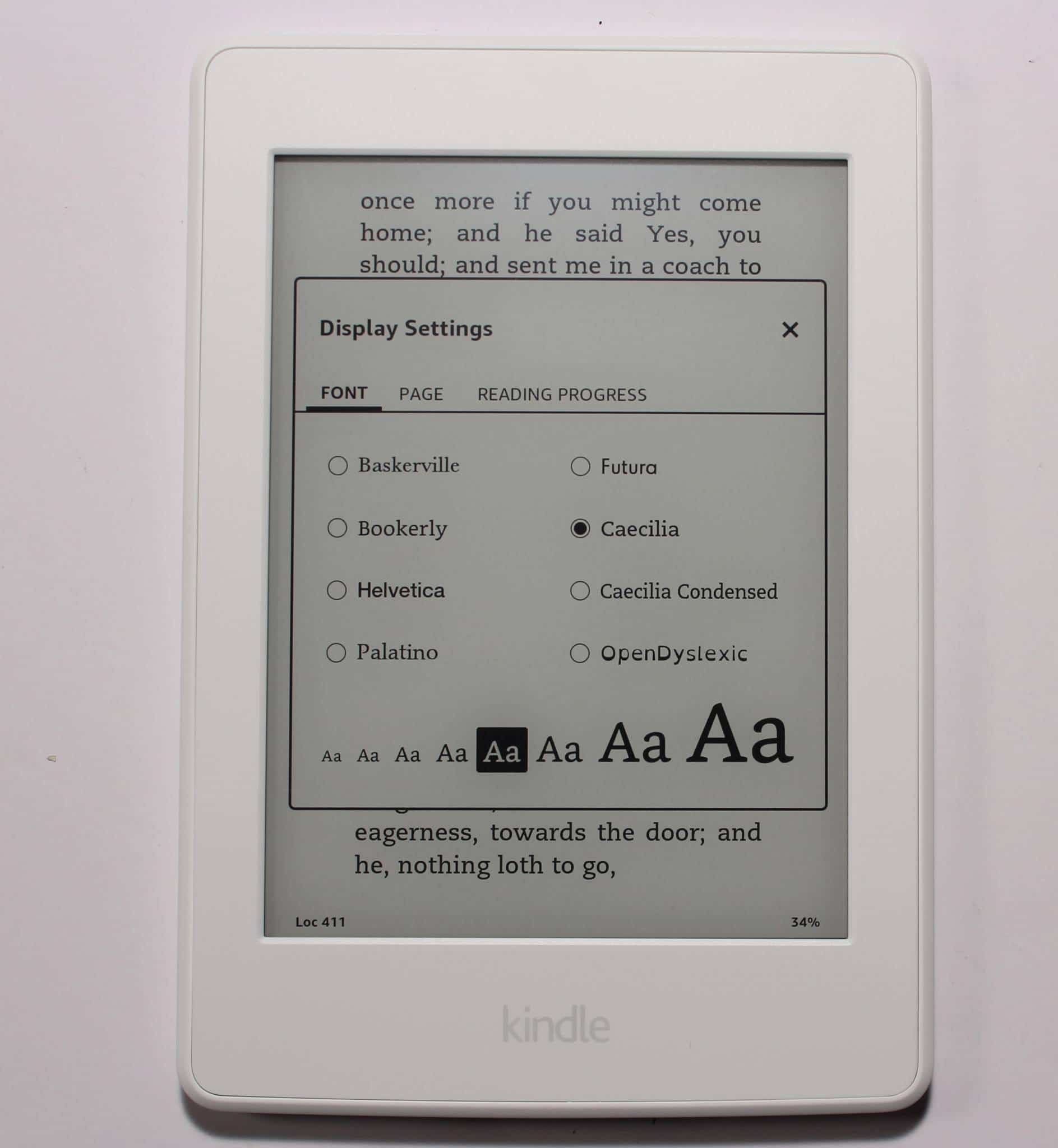
The 2016 Kindle Paperwhite has a font that was exclusively developed to make reading on a Kindle much more intuitive. Bookerly has replaced Caecilia as the new default font their e-readers, tablets and Amazons fleet of apps. Bookerly is a serif style of font that has been custom-made by Amazon to be as readable across as many different types of screens as possible. Like Google’s Literata, Bookerly is meant to address many of the aesthetic issues surrounding e-book fonts.
Does Bookerly make a big difference while reading an e-book? According to Amazon’s internal tests, that means it’s about 2% easier on the eye. That may seem like a small improvement, but spread that 2% across millions of Kindle users and billions of pages of e-reading, and it all starts to add up. In real world conditions though, this font is a big improvement. There are fewer large spaces between words, something that has been my bane for awhile, but in order for it to really shine Amazon needs to launch their new typesetting engine.
I wish Amazon had included their new Ember font, which tends to eliminate weird spacing issues between words and paragraphs, but right now Ember is only available on the Oasis and Voyage.
Like all Kindles, Amazon has their own proprietary format that makes other e-books from other companies incompatible. For example, if you buy something from Barnes and Noble or Kobo, they use EPUB which cannot be loaded or read. This is somewhat of a mixed blessing, Amazon could laser focus on providing a great reading experience and make dramatic improvements, while the EPUB format languishes.
Reading on the Kindle is great, there are enough options to optimize your experience but doesn’t overburden with a ton of advanced features. You can adjust the margins, line spacing, choose between 7 fonts and have great control over the size of them. There are 3 different tabs that all of these options, which is a welcome change, since in the recent past all of these settings were on a single menu.
Wrap up
The vast majority of the e-readers on the market are jet black and they all look similar. The Kindle Paperwhite 2016 white edition bucks the trend and right now this model and the B&N Nook Glowlight Plus are the only two currently being sold.
I would recommend this device to anyone who wants to stand out in a crowd and doesn’t want to break the bank doing it. You can buy this right now from Amazon for $119 and many times a year Amazon discounts it.
PROS
New Color!
High Resolution
Affordable
Solid Front-Lit Display
The Bookerly font makes e-book reading more intuitive
X-Ray, Whispersync, Flashcards etc.
CONS
Screen looks more grey then prior models
No SD Card
PDF experience is lacking
Rating: 8.5/10
Michael Kozlowski is the editor-in-chief at Good e-Reader and has written about audiobooks and e-readers for the past fifteen years. Newspapers and websites such as the CBC, CNET, Engadget, Huffington Post and the New York Times have picked up his articles. He Lives in Vancouver, British Columbia, Canada.
