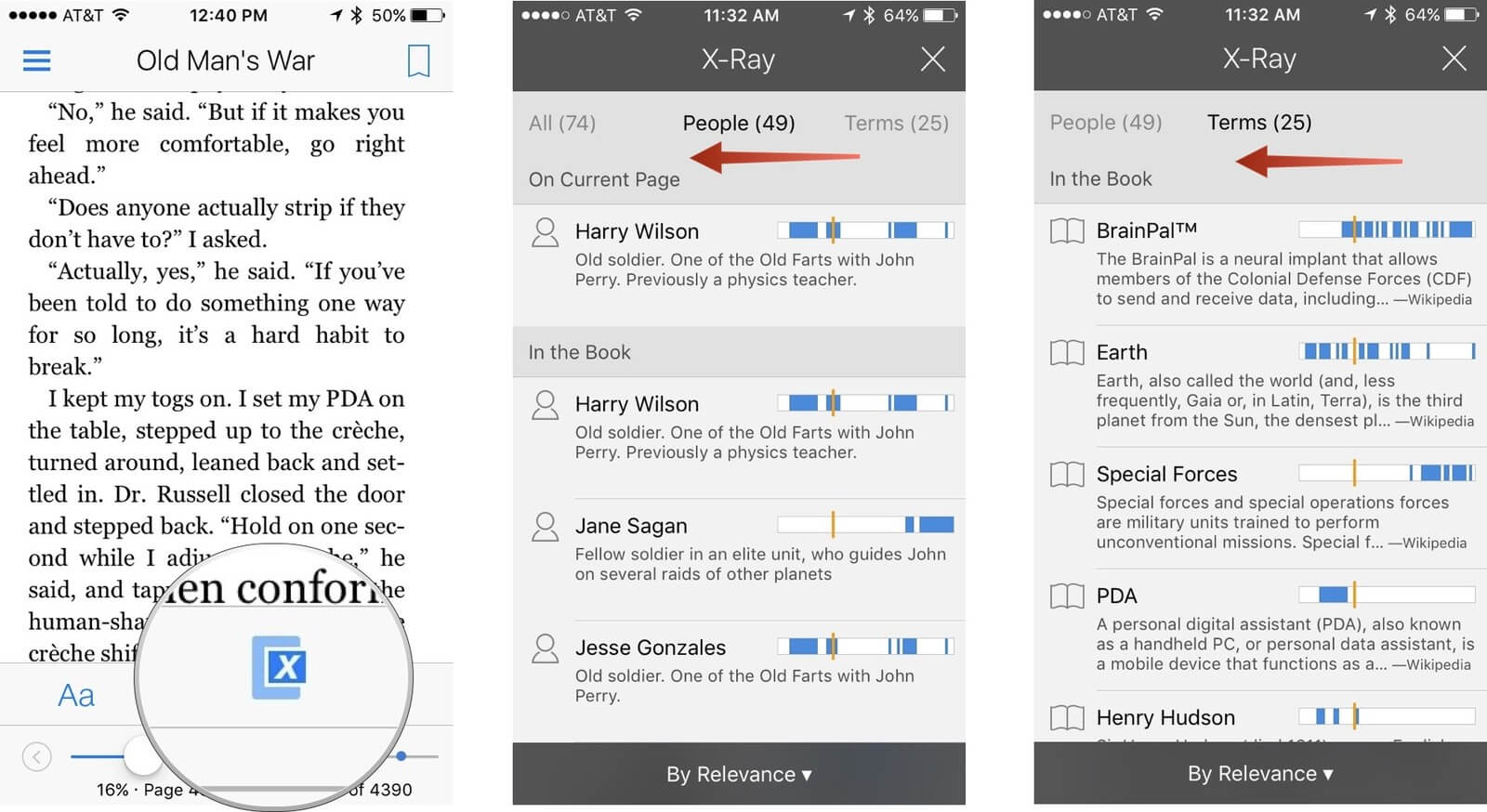
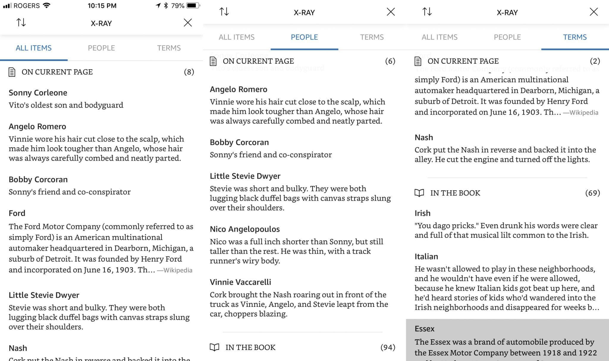
Amazon has just redesigned X-Ray for the Kindle app for the iPad and iPhone. The new interface is now streamlined and minimalist. The section does not have the graphics next to the terms, people or places that are mentioned in the book, but if you click on one of them you can see how many times they are mentioned in the book and then jump to that specific section. X-ray is now is now cleaner and more elegant.
The Kindle app has also gained a new background, green. Many popular e-reading apps for Android and iOS have a seaweed type of background, so it makes sense that Amazon would follow suit. Green joins Sepia, Black and White as the primary backgrounds.

The old X-Ray design was quite busy, there was lots of graphs and information next to each section. The color scheme did not really jive with the rest of the app.
The new version of X-ray looks really clean now. You can see that all of the headings and sections not have any any borders and the navigation area is simpler. Basically, everything has been cleaned up to have black text on a white background.
Michael Kozlowski is the editor-in-chief at Good e-Reader and has written about audiobooks and e-readers for the past fifteen years. Newspapers and websites such as the CBC, CNET, Engadget, Huffington Post and the New York Times have picked up his articles. He Lives in Vancouver, British Columbia, Canada.


